Dashboards
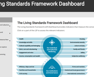
Click to view the dashboard in a new tab.
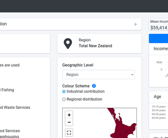
Click to view the dashboard in a new tab.
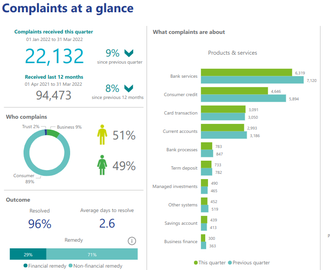
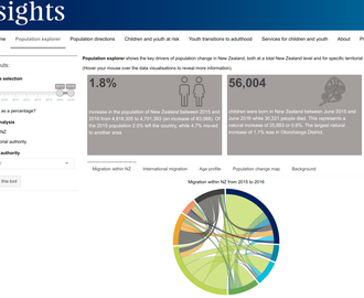
Click on a visual to open an interactive version.
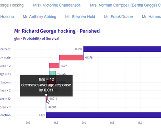
A series of plots showing the model's prediction of whether particular passengers on Titanic survived or perished based on various characteristics.
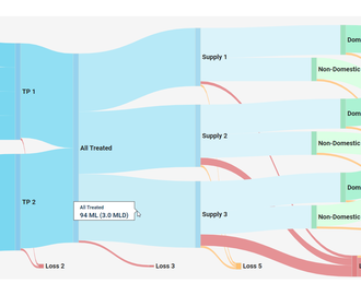
A sankey chart showing the flow of water from dams to consumers in a generic city.
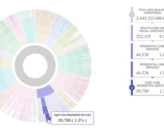
A sunburst chart showing the breakdown of New Zealand's workforce by industry groups.